Individual
Understanding the Context
My design adventure began with a bit of detective work—I explored the online homes of top architecture design firms to soak in some inspiration and catch the industry vibe. What I found was a kind of secret recipe: every great site had a welcoming Hero section, a gallery of amazing Projects, and a friendly Contact section to say hello. It was like finding the building blocks for my own design journey!
Wireframes
Diving into the creative process, I sketched out wireframes for our landing page with a clear goal in mind: simplicity. I wanted to shine a spotlight on our firm's mission and the portfolio of our dreams while ensuring that potential clients could reach out to us without a hitch. It was all about laying down a welcoming digital pathway, right from the get-go!

Visual Design
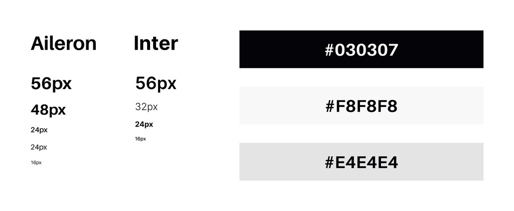
When it came to crafting the landing page for my personal design brand, I stayed true to my roots: a minimalist, professional vibe with a palette of soothing neutrals.
Final Designs
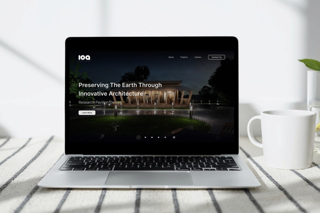
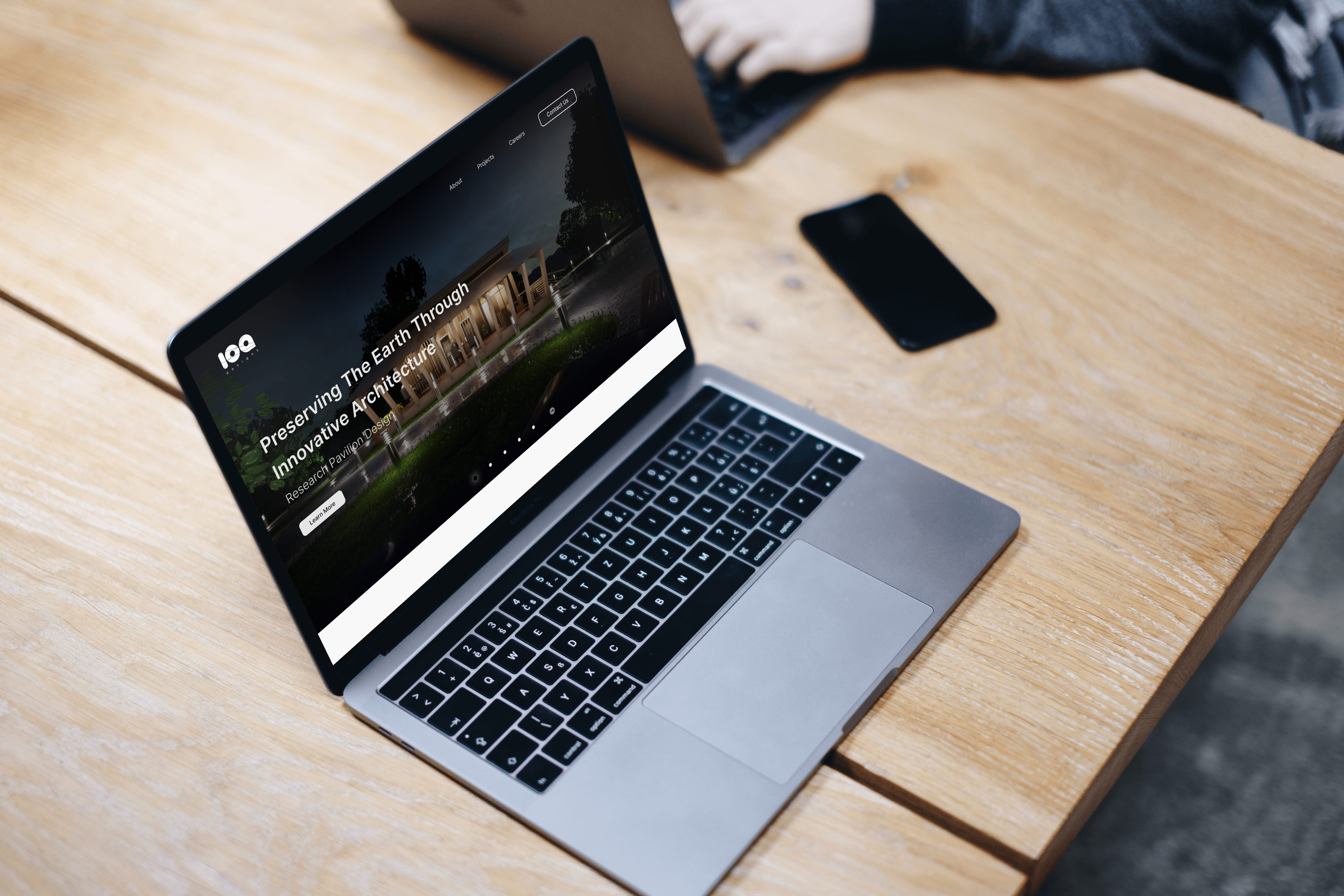
In the Hero section, I decided to let the standout projects do the talking. With a sprinkle of catchy descriptions, it's like rolling out the red carpet for new visitors and potential clients, giving them a front-row seat to what we're all about. It's our way of saying, "Hey, take a look at what we can do!" and keeping the intrigue alive from the moment they land on our page.
Post-Hero section, I introduce our essence—our goals, achievements, and dedication to reliability. It's a clear, inviting glimpse into who we are.
Next up, the Projects section offers a curated look at our portfolio, from residential to commercial spaces, inviting users to dive into our design diversity.
And for those ready to connect, the Contact section simplifies communication, ensuring a smooth path to engage with us for any inquiries or collaboration opportunities.
